


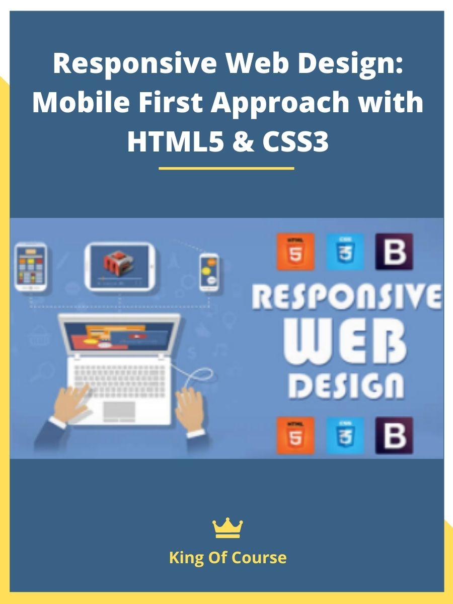
Responsive Web Design: Mobile First Approach with HTML5 & CSS3
Original price was: $200.00.$48.00Current price is: $48.00.
See all our reviews

Responsive Web Design: Mobile First Approach with HTML5 & CSS3
Understanding the Mobile First Revolution in Web Design
In today’s digital landscape, mobile internet usage has decisively surpassed desktop browsing. This fundamental shift has transformed how websites must be designed and developed to deliver optimal user experiences across all devices. The Mobile First approach to Responsive Web Design addresses this reality by prioritizing mobile users from the beginning of the design process rather than as an afterthought.
What Is Responsive Web Design: Mobile First Approach with HTML5 & CSS3?
Responsive Web Design: Mobile First Approach with HTML5 & CSS3 refers to a methodology in web design where the development process starts by designing for the smallest screen first (mobile devices) and then progressively enhances the design for larger screens. This approach ensures optimal viewing and interaction experience across all devices, particularly important as mobile usage continues to rise.
What You’ll Learn in Our Comprehensive Mobile First HTML5 & CSS3 Course
This hands-on course introduces the essential principles and practical techniques of the Mobile First methodology using modern HTML5 and CSS3. You’ll gain foundational knowledge and develop practical skills that form the cornerstone of contemporary responsive web design practices.
Practical Implementation: Building a Responsive Website from Scratch
Throughout this course, you’ll participate in creating a fully responsive website using HTML5 semantic elements and CSS3 media queries. You have two valuable learning paths:
- Follow along with our step-by-step process to build a new responsive site from the ground up
- Apply the Mobile First techniques to transform your existing website into a responsive, mobile-friendly experience
Key Technical Components Covered in This Course
- Setting up the proper viewport meta tags for mobile optimization
- Implementing fluid grid layouts with relative units (%, em, rem)
- Utilizing CSS3 media queries to create responsive breakpoints
- Leveraging HTML5 semantic elements for improved structure and accessibility
- Optimizing images and media for mobile devices
- Implementing touch-friendly navigation systems
Hands-On Learning with Real-Time Mobile Testing
Watch your work come to life as you test your responsive designs directly on mobile devices. This immediate feedback loop accelerates learning and helps you understand how responsive design principles function in real-world applications.
Why the Mobile First Approach Matters for Modern Web Development
The Mobile First methodology offers numerous advantages over traditional desktop-first approaches:
- Forces prioritization of essential content and functionality
- Improves performance by starting with the leanest possible design
- Creates a solid foundation that scales up naturally to larger screens
- Aligns with Google’s mobile-first indexing practices
Conclusion
Mastering Responsive Web Design with a Mobile First approach using HTML5 and CSS3 is an essential skill set for today’s web developers and designers. This course provides the fundamental knowledge and practical experience you need to begin your journey toward creating websites that deliver exceptional experiences across all devices. By learning to prioritize mobile users while utilizing the power of modern HTML5 and CSS3, you’ll be well-positioned to meet the demands of our increasingly mobile-centric digital world.
After you make payment, we will send the link to your email then you can download the course anytime, anywhere you want. Our file hosted on Pcloud, Mega.Nz and Google-Drive
KING OF COURSE – The Difference You Make
More Courses: Business & Sales
Q & A
Related products

SEO & Web Design

SEO & Web Design
RankXL – Authority SEO 2.0 – Zero To 100.000.00 Visitors Per Month

SEO & Web Design

SEO & Web Design

Internet Marketing

SEO & Web Design

SEO & Web Design

Internet Marketing
Master Level Marketing – Master Level Marketing Lifetime Access
Reviews
There are no reviews yet