


Design the Web: Creating CSS-Only Navigation Menus
Original price was: $129.00.$40.00Current price is: $40.00.
See all our reviews

Design the Web: Creating CSS-Only Navigation Menus
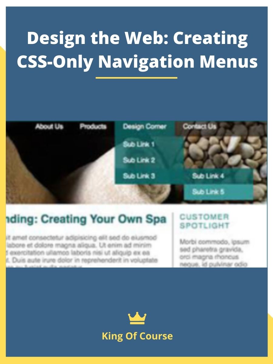
Are you looking to enhance your website’s user experience without relying on complex JavaScript frameworks? In this comprehensive guide on Design the Web: Creating CSS-Only Navigation Menus, you’ll learn how to develop fully functional dropdown menus using just HTML and CSS. Discover how these lightweight, responsive menus can elevate your site’s functionality while remaining accessible across various devices, including iOS and touch-screen Windows platforms.
Why Choose CSS-Only Navigation Menus?
- Simplicity: With no dependency on JavaScript or external libraries, CSS-only navigation menus are easier to implement and maintain.
- Faster Page Load: Eliminating JavaScript frameworks reduces the overall page size, ensuring a quicker load time and a smoother user experience.
- Broad Compatibility: CSS-based menus work consistently across major browsers and offer robust support on mobile devices, including iOS and Windows touch screens.
What Is Design the Web: Creating CSS-Only Navigation Menus?
“Design the Web: Creating CSS-Only Navigation Menus” is an online course available through LinkedIn Learning. This course, which lasts for less than an hour, is designed to teach participants how to create efficient and visually appealing navigation menus using only HTML and CSS. It covers topics such as nesting unordered lists, overriding default styles, managing submenu displays with hover effects, and making the menu responsive for different device screens. The course is led by Chris Converse and is suitable for beginners looking to enhance their web development skills, especially in creating drop-down and other types of navigation menus without the need for JavaScript.
Key Steps to Creating Multilevel Dropdown Menus
Nest Your Lists
Begin by creating a well-structured HTML list that nests submenus within primary menu items. This hierarchical format is essential for building dropdown functionality solely with CSS.
Style and Position the Menus
Use CSS selectors and properties to craft each menu’s appearance. Adjust spacing, colors, and borders to match your site’s design. Position the submenus absolutely so they appear underneath or adjacent to their parent items.
Add ARIA Markup for Accessibility
Incorporate ARIA attributes to ensure screen readers and other assistive technologies accurately interpret your menus. This critical step promotes inclusivity for all users.
Ensure Responsiveness
Employ media queries to adapt your menu layout and styles for various screen sizes. This approach guarantees an optimal user experience, whether on a desktop, tablet, or smartphone.
Free Exercise Files for Hands-On Practice
All members can download the exercise files to follow along and apply these techniques directly to their own projects. These step-by-step resources make it easy to test out different styles, practice responsive design, and master CSS-only dropdown menus.
Conclusion
In Design the Web: Creating CSS-Only Navigation Menus, you’ve seen how to build interactive, mobile-friendly menus without relying on JavaScript. By properly structuring HTML lists, applying smart CSS styling, and integrating ARIA markup, you can offer a professional-level user experience across devices. Download the free exercise files today, and start experimenting with your own multilevel dropdown menus to take your website’s navigation to the next level.
After you make payment, we will send the link to your email then you can download the course anytime, anywhere you want. Our file hosted on Pcloud, Mega.Nz and Google-Drive
KING OF COURSE – The Difference You Make
More Courses: Business & Sales
Q & A
Related products
Internet Marketing

SEO & Web Design
DIYthemes Focus — Best WordPress Theme On The Planet Since 2008

SEO & Web Design
ConversionXL & Chris Mercer – Google Analytics For Intermedia

SEO & Web Design

SEO & Web Design

SEO & Web Design
RankXL – Authority SEO 2.0 – Zero To 100.000.00 Visitors Per Month

SEO & Web Design

SEO & Web Design
Reviews
There are no reviews yet